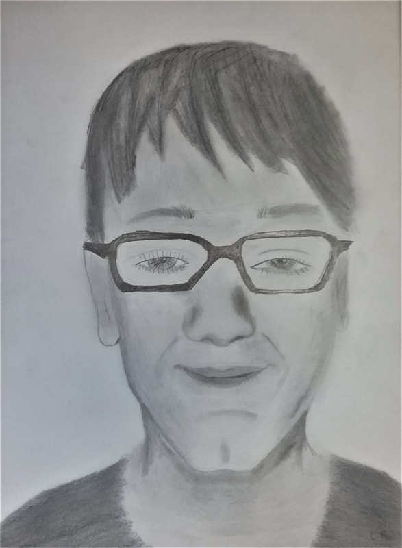
The Person
Levin Robins Self-Portrait, 2018 My art is called "The Person", the theme is a self-portrait in the medium of pencil. When I look back at this when I'm 60 I'll be like I did good on this. I think about when I failed on this and it is a good thing I did not fail on this one. I'm good at most things but not art. I'm not good with self-portraits and I hope I don't have to do this again. (Mrs. Worden does not agree, you are good at Art!) 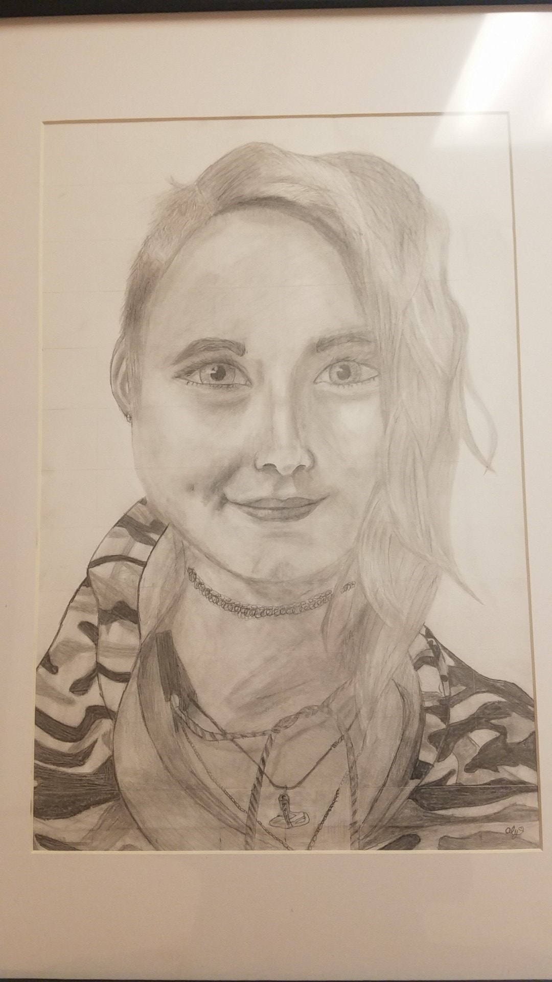
Thine Self
Alyssa Lindvall Pencil, 2018 The name of my piece is thine self. The project theme for this was a self portrait of myself. The medium I had used was pencil. The story behind my self portrait was the photo was taken because I don't have a selfie that was decent enough. My personal reason behind this was just showing my facial features. In art class we were assigned to do a self portrait. The project took me one week to complete and was fairly stressful to do. I finished through with a drawing I was happy with. I first started the project with a graph and a photo of me. I lightly traced out the shape of my face and shoulders. Then I erased the graph and started to shade around where my nose and lips would be. I then traced my eyes and filled and shaded them. I finished with doing my hair and darkening areas until it was up to my standard of done. The element I had used was shape which is the way something is formed. My principal was proportion which is making sure your nose is not as big as your head or one eye is not the size of a strand of hair. Fun Fact: In 1839, Robert Cornelius produced the first-ever photographic portrait, which was a self-portrait. 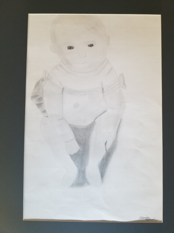
Baby Steps
Jamie Carmain Pencil, 2018 Baby Steps is a self-portrait done in the pencils . I named this baby steps because this is a picture from the first time I went to the beach. I used form and movement. An element of art that is three-dimensional and encloses volume; includes height, width AND depth (as in a cube, a sphere, a pyramid, or a cylinder). Form may also be free flowing. A principle of design used to create the look and feeling of action and to guide the viewer’s eye throughout the work of art. 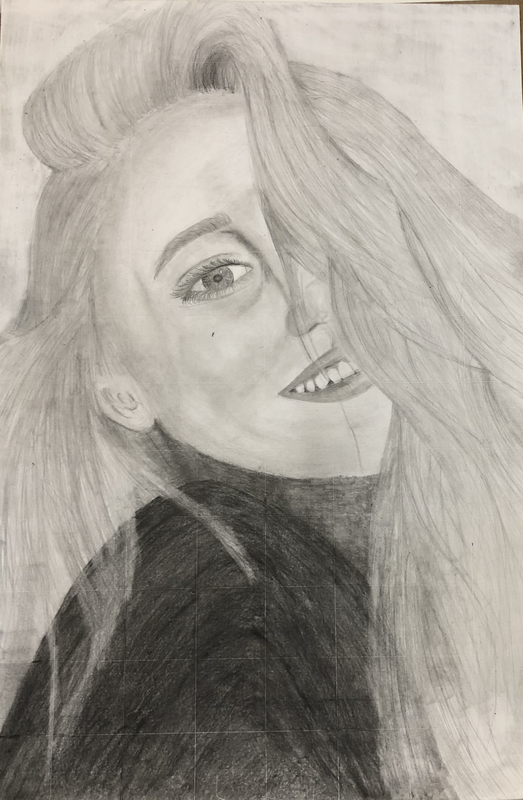
Chapter Sixteen
Kellie Welte Pencil, 2018 I am naming this piece Chapter Sixteen. I drew this self-portrait in pencil. I am naming it this because as you live your life you grow and change as a person throughout every chapter of your life, and this piece reflects on what chapter I am in currently. With every chapter you make new friends, discover more things about yourself, and overall grow wiser as a person. No matter what chapter of life you’re in there’s always going to be bad times, but they are only there to make the good times seem better. Chapter Sixteen reflects who I am as a person and how I see myself and I’m anxious to see what the future holds. I began my project with creating the shape of my face and then slowly incorporating my facial features. I spent lots of time making sure my features were proportional and putting emphasis on shading and blending. Fun Fact: The word “pencil” comes from the Old French word “pincel”, meaning “a small paintbrush”. Sweet 14
Kylie Stover Pencil, 2018 My portrait is called Sweet 14, and I used the medium of pencils. I wanted to name it Sweet 14 because when i look back on it, I will remember my youth and remember the memories I made. I began by making the shape of my face, shading it and blending. When I finished the first part of the shading, I started my eyebrows, eyes, nose and lips. After that, I did my other shading and started the details. After the face was finished, I did my hair. I used the element of line, for the lines of my face and hair. I used the principle of balance to distribute visual weight throughout my piece. Fun fact: Before the invention of erasers, artists would use bread crumbs to clean mistakes. |
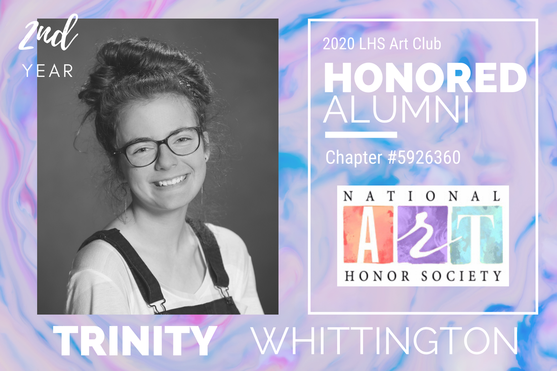
Cheese
Trinity Whittington Graphite, 2018 My Pencil portrait is called "Cheese" and I colored it using the medium of graphite. I wanted my portrait to look realistic, so I shaded it. Instead of using a picture I had, I'd decided it was better to take a photo in the hall. It'd be easier to tell where the highlights and shades where in my face. 
Curl Man
David Halligan Self-Reflection 2018 My drawing called Curly Man, and I drew it in the medium of pencils. I wanted my project to look like myself, so it is why I used a picture of myself. I called it Curl Man because it is the name of myself. My picture reminds me of myself a lot, it is very on point. the realism of this drawing is real and beautiful, and I wanted my project to reflect that. I began by drawing lines and following my picture guide When I got done with the bigger piece, I started adding details.. I then started to begin shading and I finally finished a couple days later. I used the element of value to shade all of my drawing, and the principle of proportion to make sure my drawing was as close to the real thing as possible Fun fact: In 1839, Robert Cornelius produced the first-ever photographic portrait, which was a self-portrait. And Between 1886 and 1889, Vincent van Gogh painted thirty-seven likenesses of himself. 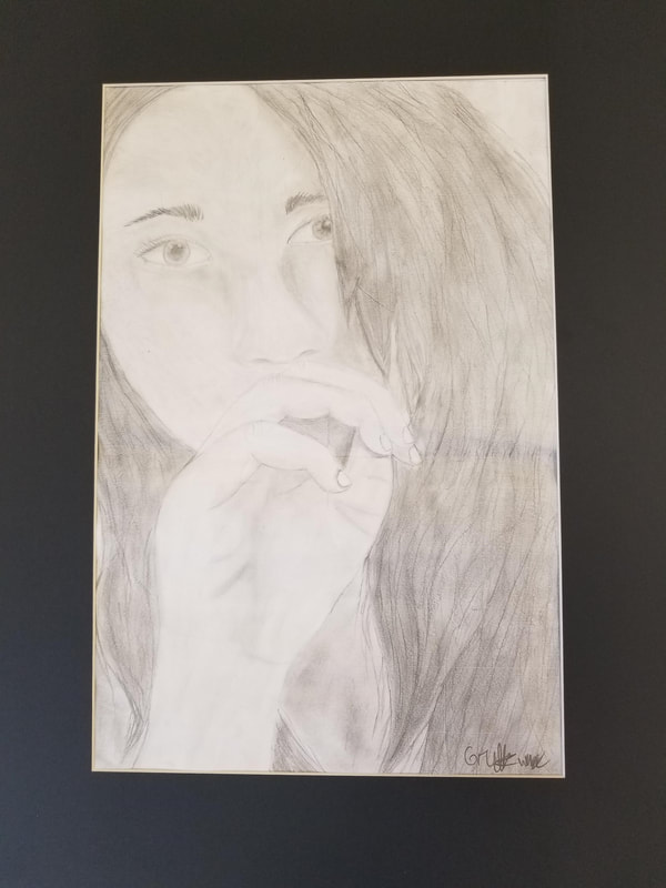
Behind the Hand
Gretta Warne Pencil, 2018 My self-portrait is named Behind the Hand, and the medium I used pencil to sketch and shade it. I used a lot of different shades of pencils to get the right definition. I called it Behind the Hand because I have my hand hiding a feature of myself that I highly dislike, my smile. My smile has always been a feature I hid due to it either being too cheesy or just overall ugly looking, I tend to hide it. I began by sketching out the base of my face and hair. When I was done planning out my facial features, I started shading. I finally finished shading and added the last details in my hair. I used the element shapes and the principle of contrast. Fun Fact: This portrait was the first time I’ve fully shaded. 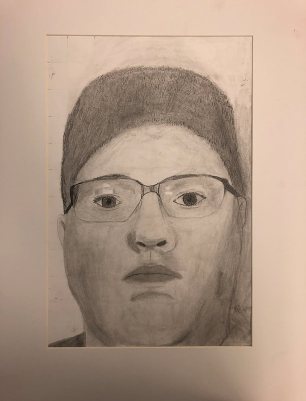
Gave It A Shot
Jeff Fuqua Pencil, 2018 This drawing is named Gave It A Shot, drawn in medium of pencil. I am new to this form of art so when I started I could not do anything, so I kept saying I’ll give it a shot. Apart from it being me I have no real connection to it, am I happy with it? Yes, I tried something new and feel like I did a good job. This was a new art style that I had to learn. The element I used Value, the difference between light and dark areas on the drawing. The principle I used was Unity, all the parts of an art work working together to create a piece of art. I started my drawing by taking a picture and then started the outline of my head. From that I had to start with the details of the face and the eyes. With the help of Mrs. Worden I was able to correctly shade my eyes and the details of my mouth/face. When that was done I had to add details and start the shading process, I used shading to highlight parts of my hair and head. Using a B6 pencil I was able to make my hair look like hair. Mixing shading with the blending of the leads you can get a good look. I tried to make sure that there were no lines that stood out too much. Fun Fact: In 2012 a Swedish artist Fredrik Saker created a super-detailed self portrait and successfully submitted it as his driver's license picture. 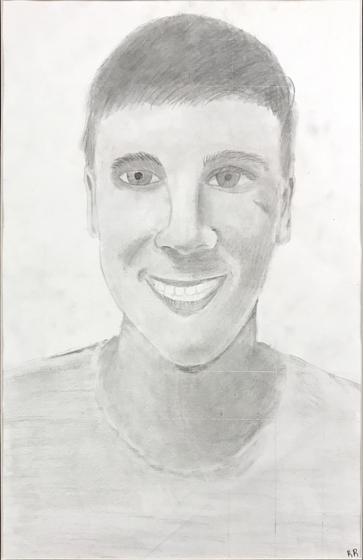
A Rare Occasion
Rex Ritterman Pencil, 2018 My artwork is called A Rare Occasion, I used pencil and shading to draw this piece of work. The story behind this selfie is that I didn't have one to hand in because I don't take selfies very often and if I do I don't save them. The element and principle I used was: • Element- Line; I drew lines for the face, eyes, mouth, etc. • Principle- Balance; More specifically asymmetrical balance, because of the shading and slight imperfections on my face The process was very hard and took me a long time to finish the artwork Fun fact- First known self-portrait came in 1433 by Jan van Eyck |
Surrealism Color Pencil Project
Floating Away In Fear
David Halligan Colored Pencil 2018 First, I started by putting a piece of paper on the window with what I wanted to draw to get the basic idea and I traced all the things that I wanted only to draw all that on a whole other piece of paper until I got the final product that I was looking for. The element that I used for this project is color, I used many colors to make sure that I got a very nice colorful paper that was easy on the eyes. The principle that I used is Unity to create a very peaceful photo, when I look at my photo I get a sense of peace and relaxation. The Choice
Jeff Fuqua Color Pencil 2018 My surrealism dream project is called "The Choice" in the medium of colored pencil. The four nouns in my project, the person is the devil short and simple, the place is in between worlds. The animal is a hose turning into a multi-colored snake with three heads, the thing in my dream is an orb and Devils' thrown. The story of what is in the art work is that in my dream I had to make a choice to join the devil as a replacement for him or stay in the human world to die like the rest. To accept the position I needed to sit in the thrown and touch the orb. I have never been able to figure out if I accept the position or refuse, but I feel it would have been a lose-lose situation. If I take the position as ruler of hell I would have to give up my humanity. To, give up the position I would then have to deal with the devil and get back to my world. When I started my art work I did a quick sketch of a dream I had. When I had the sketch I did a trace of the outline in color pencil so that the whole project will look the same. After carefully coloring the objects in my project I had to fill it in. I started with the lightest colors I could find, after that I found two other colors of kind of the same hue to then add shades into parts of the art work. I used images of the object in my dream to try and shade them correctly. To finish the picture I went over the whole thing with a colorless pencil to blend if you will the colors. The element I used color, light reflecting off object. I used color to accent the areas I wanted focus to be and then also shade them in to try and give a three dimensional look. Principle Variety, element that guides the viewer's attentions. The way I used Variety is making it so everything is connected so, that the art work would flow and not be choppy. Childhood dreams are shorter than adult dreams and nearly 40% of them are nightmares, which may act as a coping mechanism 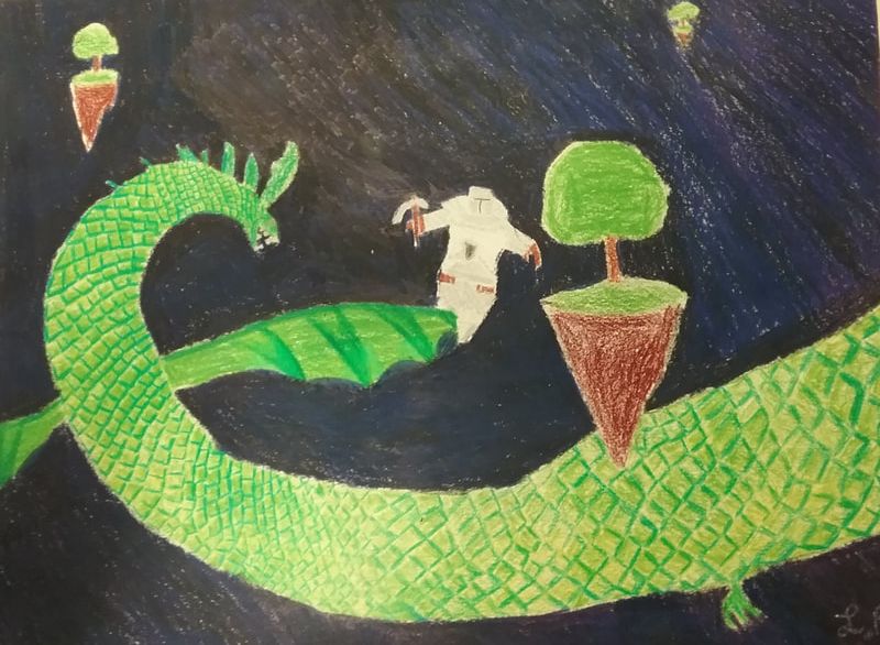
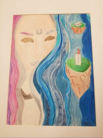
Fighting your Fears
Levin Robbins Color pencil project,2018 My surrealism colored pencil project is called "Fighting your Fear". When I am 50 I'll look back at all the good things I did and this project is one of them. this is one of my favorite projects and I really like making it. The way I would describe this art is there is a knight jumping to fight a dragon with a pickaxe next to some floating island in space. To see a knight in your dream signifies honor and loyalty. To see yourself on an island signifies ease and relaxation. To see a dragon in your dream represents your strong will and fiery personality. First I drew what my picture was going to look like, then I outlined the picture with colored pencil, then I colored the dragon, the floating islands, the knight, and then the background. my element is color, I used color everywhere on this project. My principle is pattern, I used pattern on the dragon scales. 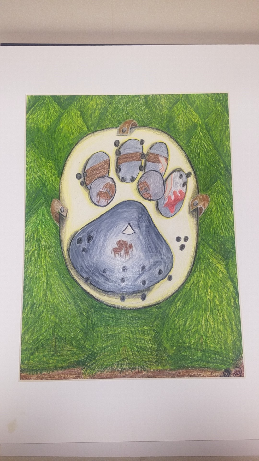
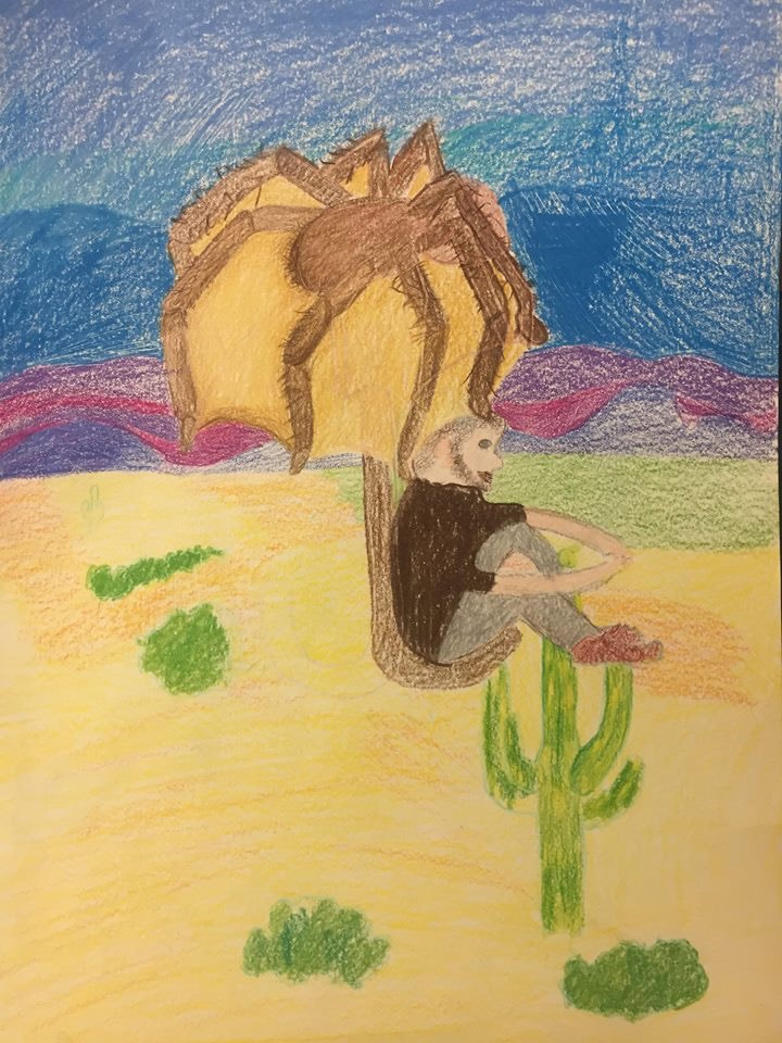
The Nightmare
Alyssa Lindvall Color Pencils, 2018 The name of my art is The Nightmare, the theme was dreams, my medium was colored pencils. The history of the look of my art is i have had a dream where i was in a basement with 3-4 people who are important to me at the time. Then someone in a hockey mask comes down stairs and well...murders them. The other dream is I'm walking in a forest and i find a dog print with a hatchet next to it. My personal meaning to this is its my nightmare I've been having the last couple months now. The basement area is the main place next to the most important people to me. There's a man who comes down the stairs and slits throats . I started my art by thinking of how to make it "trippy". I began drawing out a hockey mask with a dog paw on the mask. I then made trees like in a forest in the background. I had put the basement look in the pad of the paw and in the eyes of the mask. Then I started on putting it on a different paper with only colored pencils. The element I used was shape to make the dog paw and hatchet. The principal I used was variety by using many different colors to create my art. Far Out
Trinity Whittington Color Pencil, 2018 My project is called Far Out, and I colored it using Prisma colors. I tried to get the lady's hair to look wavy, so I made it lighter in certain areas of her hair. I call it far out because of the oddities. I imagined a place almost like our own, but not quite right. It's different, and I've always had a fascination with space. Dreaming about Galaxies represents your ideas, dreaming of islands could be your subconscious telling you to relax, wolves represent teachings and guidance, dreaming of a staff represents someone who may be easy to lean on, but are really hurting as well. I wanted her hair to look as if it was its own universe. I began with a rough outline of what I would do, and once I finished with it, I began to trace it with color pencils. Once I had colored most of it with the desired color, I went back in and added layers. I wanted to make sure it had more of a realistic effect. I used the element of Color, which is the light reflected off objects, and I used the principle of Balance, which is the distribution of the visual weight of objects, colors, texture, and space. |
Timmmy
Jamie Carmain Colored Pencil 2018 Timmmy is done in Prisma colours, which are pretty but they aren't my favorite to use. Timmmy is the little bird that sits crying at the corner of the page. The lady who seems to talk up all the room is Luna. Luna is the moon goddess. She is often represented as the female version of the sun god. Wicca cultures believe that see a moon in your dreams symbolisms many different things such as happiness, calmness, serenity, and beauty. Timmmy is a raven. Seeing a raven in your dreams symbolizes misfortune. However seeing a flying raven means that you will face bad luck for a temporary period of life. Galaxy dreams refer to your creativity. Dreams of floating can suggest that we are on a new course or path in life. The sword symbolizes a desire to battle. Space is the element I used. Space refers to the area in which art is organized. Emphasis is a principle I used. Emphasis refers to the created center of interest. I used space to help me organize my drawing. Emphasis was used on Luna to show that she was the center of my art piece. Cosmic Imagination
Kellie Welte Color Pencil, 2018 The name of my project is Cosmic Imagination in the medium of prisma color pencils. The story behind my work is a series of surreal dreams I've had since I was young. I took specific nouns from each dream and compiled to into one project. I tried to incorporate the most intricate and creative nouns from each dream whether the dreams were good and happy dreams, or nightmares. Some of the nouns are dreams I had when I was very young that I remember. The witch for example, I used to have this reoccurring dream that a witch was coming out of my closet to come and get me. The nouns I used in my project represent different things. The witch for example, which represents evil and destruction. The confetti that is coming off of the witch represents achievement and success. The octopus tentacle that is acting as the witch's tongue represents being entangled in some difficult matter . The galaxy in my drawing represent creativity and awareness, along with the planets which depict creativity and exploration. The goldfish in the galaxy signifies wealth, success, and pleasant adventures. I started out sketching the witch since that is what the eye immediately attracts to. I used the lightest shade of green and began layering the colors and shading with other shades of green until I achieved the look I desired. Then I made the tongue which is an octopus tentacle which required several shades of pink and red. Then I started on her hat which was the easiest part since I used just solid colors and come different shades of purple on the band of the hat. Next I started on the grey hair. For this part I used several shades of washed out browns, silvery greys and even some cool toned blues to get the desired look I was going for, which was "old hag". Then I drew out the planets and wrapped the witches tongue around planet Earth. Then I drew the green confetti coming off her face. For this I just drew small green squares. After this I drew the background which is a galaxy. For this I used several shades of light blue, dark blue, purple, dark purple, black, and even white and silvers. One of the elements I used was value, which refers to dark and light. I used this is the witches face to make it appear three dimensional. One of the principles I used is variety, which is the use of several elements of design to hold the viewers attention and to guide the viewers eye through the artwork. This part is pretty obvious, as you can see I brought in many miscellaneous nouns and ideas into this piece. The Dark (K)night
Rex Ritterman Colored Pencil, 2018 My project is called "The Dark (K)night", and I used the medium of colored pencil. The 4 nouns I used are: Batman, Bat, Gotham City, and stars. I used these because it reminded me of being a kid again and binge watch Batman movies all day. Analyze your nouns with that link about. I began my project by drawing the Batman logo first with Batman's head on a bats body. Next I drew the very colorful water the city is on, then I started drawing and coloring the buildings of the city and creating the skyline. And finally I put the night sky in with many stars. The element I used was shape, that I used on the buildings. The principle I used was pattern when I put the stars on them. Fun Fact: colored pencils are considered to have the longest shelf life of all artist mediums. 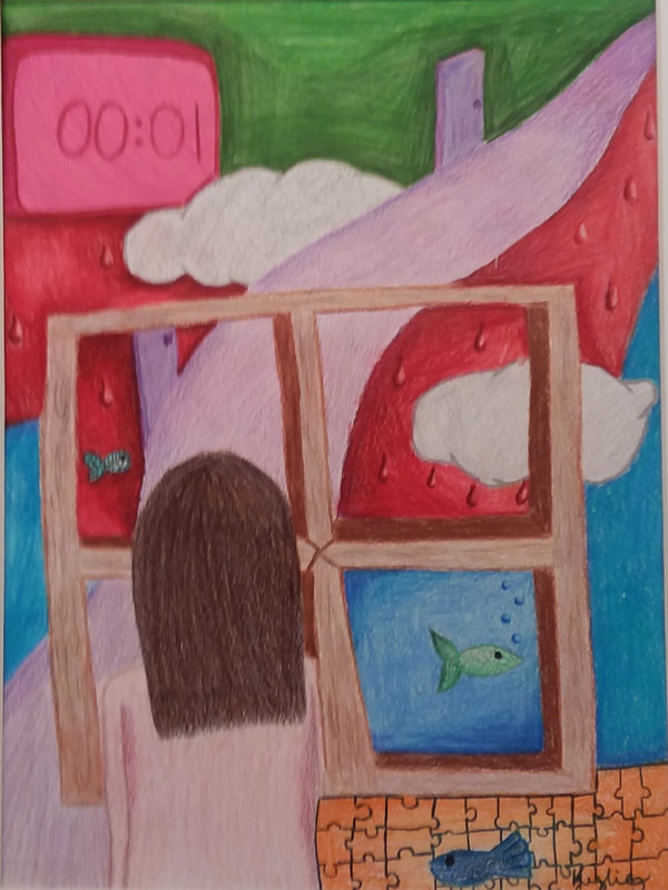
Hallway of the World
By Kylie Stover Colored Pencils The name of my project is Hallway of the World, the theme is the objects from my dreams and my medium is colored pencils. The history of the look is from 2 different dreams. One where I was wondering a hallway in the sky with clouds around me. The other dream was full of color; everywhere i looked was different splotches of color and there were fish everywhere I looked. The clock is in every dream I have that I can remember; always with the same time of 00:01. I started by imagining how to give it a really creative, surreal look. I began drawing the hallway, window seal and other nouns with light colored pencils. Once I had some that, I started shading all the objects and adding color and dimension. After that I added details to the splotches of color. I used the principal of balance. |
