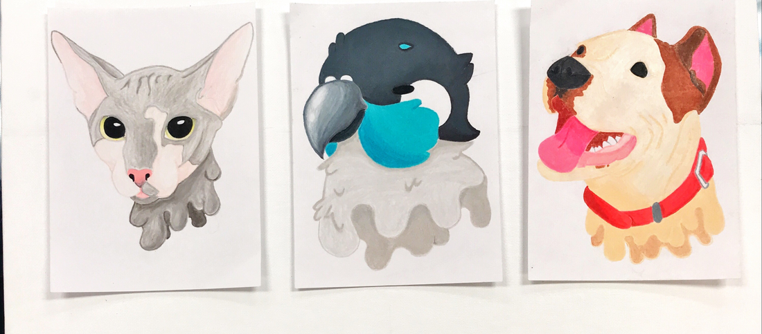
Hekin Good Boys
Tate Renfrow Color pencil 2019 I made these pieces named Hekin Good Boys because I wanted to draw the breeds of dogs that I would like to have in the future. Instead of drawing them in a realistic style I drew them in a cartooned style witch I enjoy working in. I drew these dogs because as a kid and still to this day they are my favorite breed of dogs. I like the pitbull because of how sweet they can be, their muscular physique, and how they are basically a gun you can pet. The other is a pug because who doesn’t want a pug they are just like tubby baby with fur. I made these pieces but first sketching the dogs on adobe illustrator on my computer with a drawing tablet then I picked up a pencil and paper and drew the sketch on the paper. After the outline was done I started to color the dogs fur color and the features. I used inline and shape to make the heads, features of the dogs and the folds in their skin. I also used proportion to make the heads and feature accurate to reality but also contrast to show light and darkness on the faces. Tate Renfrow
Marker, 2018 Kayla McMahon
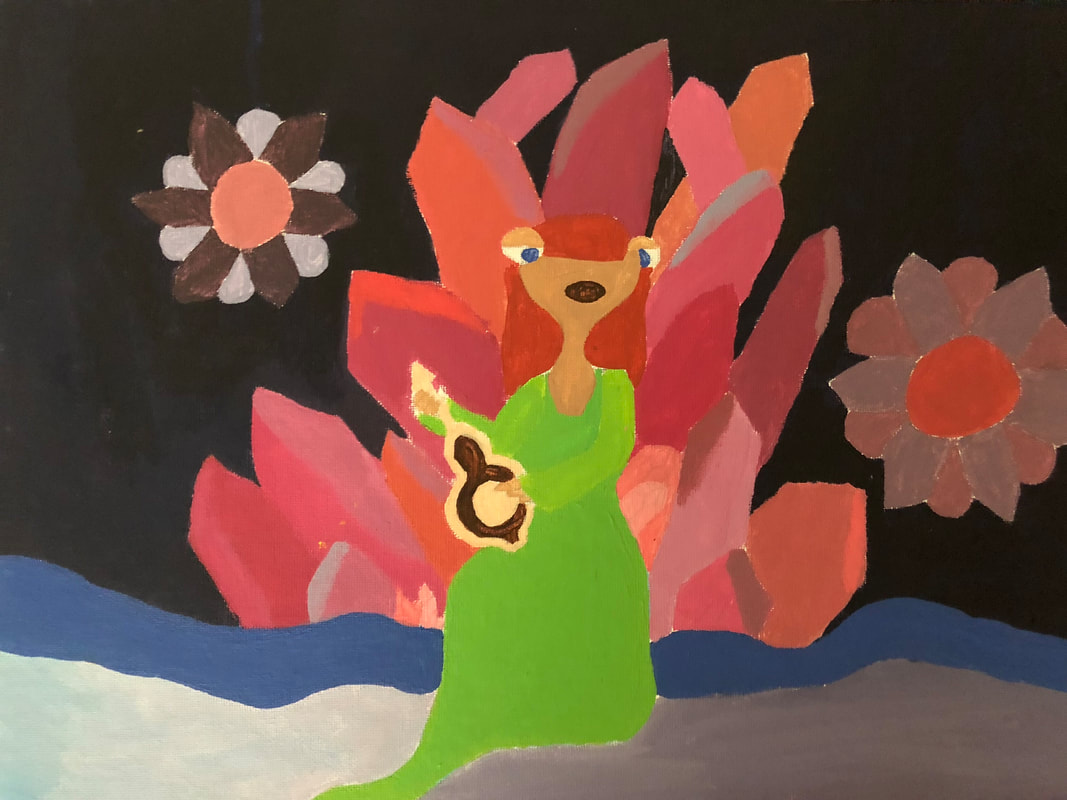
Anahita Acrylic, 2018 Anahita is an acrylic painting of …… The name “Anahita” comes from Iranian culture, and is a misunderstood goddess of water and fertility. The personal meaning for me about this peace is I have given her a personality of my own. Her look in her faces shows no emotion because she has taken criticism over the years and now she doesn’t care what people have to say anymore because she is who she is, and she knows she is perfect just the way she was made even though other goddesses think they are better then her. So Anahita has grown to have a hard exterior but caring, unconditional loving interior and she gives the gift of fertility to people to spread and share her inner love. I began drawing lightly on my canvas right away. I first began with a head shape to build off of. Then I began giver her sea creature features, such as her ears and fins on her neck. Then I basically just jumped right into painting. I first started with the blue skin color and then added different colors of blue to add a cool effect for lighting. I then repeated the whole process over sing with the different body parts and with different colors. One of the elements I used was value. Value is the lightness or darkness of tones or colors. White is the lightest value; black is the darkest. The value halfway between these extremes is called middle gray. I used value on the head and eyes shading different areas. Another element I used was color. I used many different colors in my price such as blues, greens, and pinks. Color is an element of art made up of three properties: hue, value, and intensity. The first principle that came to my mind was variety. I found lots of variety in my colors I used throughout. Variety is the principle of design concerned with diversity or contrast. Variety is achieved by using different shapes, sizes, and/or colors in a work of art. The next principle I used was movement because all throughout the work I have something that catches your eye. Movement is a principle of design used to create the look and feeling of action and to guide the viewer’s eye throughout the work of art. Woman Power
Kayla McMahon Colored Pencil 2019 The name of my artwork I created is Woman Power, and the medium I decided to use was colored pencil. There is a lot of history in this piece. It might just look like a bunch of eyes, but that just isn’t it. This is a bunch of different times in history AND ethnicities blending together on the page. The personal meaning to me, is mainly nostalgia. When I look at the work I did, it brings me nostalgic emotions that flash me back to my childhood. Emotions that always would bring me joy, and happiness. Disney is a safe haven for many people around the world. Disney brings out so many emotions when watching it, and I really wanted to make my picture life like and cinematic. The process I used began with me searching online for a Disney Princess I enjoyed, and focusing on the eye shape, and transferring that shape on paper. The paper I decided to use was brown, so the whites of the eyes could really pop. After drawing the shape in pencil, I then began coloring the irises the designated color. I blended many times to make sure the colors looked proper and shined and gleamed in the light. Next I would fill in the pupil with black, then filled in the whites of the eyes, and eyebrows as well. Then, finally I labeled the designated princess’s name above. Then repeated the process over again. This project relates to my project because Disney Princesses are the earliest of little girl fantasies. Every little girl watches those movies and want, wish, and hoped that they could live in a world half as amazing as the Disney world. Now I will begin talking about two elements I used in my artwork. The first element I used was texture. Texture is an element of art that refers to the way things feel, or look as if they might feel if touched. I used texture through the whole piece. I made sure the waxy feeling of the colored pencils really played into the glossy look of the eyes, to really give it that animated feel and look. The next element I used was value. Value is the lightness or darkness of tones or colors. White is the lightest value; black is the darkest. The value halfway between these extremes is called middle gray. I used value using different colors and tones in the eyes to give dimension and inner depth. Now I will be moving onto the principals I used. I first used emphasis. Emphasis is a way of combining elements to stress the differences between those elements. I used value and color of the different areas of the eyes to show difference and contrast. The next one I used was rhythm. Rhythm is a principle of design that indicates movement, created by the careful placement of repeated elements in a work of art to cause a visual tempo or beat. I used Rhythm in the irises of all the eyeballs to indicate light reflecting off of them. Potion I and Potion II
Kayla McMahon Water color The name of my artwork is called potion and potion II, my theme is fantasy, and the medium I did for both projects was water color. The history behind my project was I wanted to create a very Halloween looking price because of the month of October. The personal meaning of my work is that I wanted to show a cute innocent and fun side of Halloween. My process I used for both my creations was I drew out my heads first, then continued to draw the objects around the head like the hair, the hat and for the other project, the bottle. The two elements I used was shape, shape is an element of art that is two-dimensional, flat, or limited to height and width. I used shape with making the form of my crystal ball in potion, and head shape in my potions II project. The next element I used was line. Line is an element of art defined by a point moving in space. Line may be two-or three-dimensional, descriptive, implied, or abstract. You can see line in the hair strands in both Potion, and Potion II. Now I will be explaining my principles. The first principle is balance, balance is a way of combining elements to add a feeling of equilibrium or stability to a work of art. Major types are symmetrical and asymmetrical. You can see balance in Potion with the little witch’s eyebrows and eyes, as well as in Potion II with the eyelids. The final principle I used was emphasis. Emphasis is a way of combining elements to stress the differences between those elements. I used emphasis with with the colors on the hat with the purple and green. 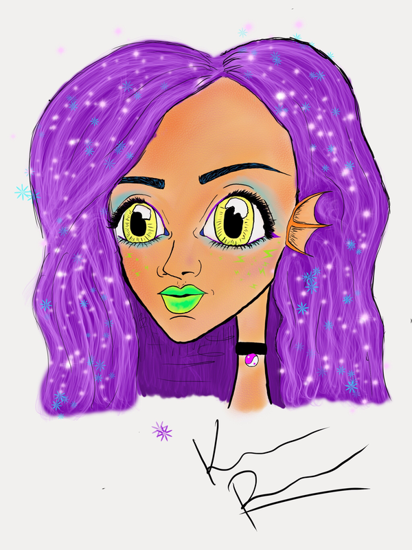
|
Sid's Queen
Rachel Kadelbach Acrylic Paint, 2018 My project is named Sid's Queen, and I used the medium Acrylic Paint. In my project I wanted it to be colorful and for my crystal throne and Queen to pop out so I used bright refreshing colors on them, and the background to be a dark blue so those two would pop out even more. I named my project Sid's Queen from the movie Ice Age, Sid meets this other sloth that rules a magical crystal place and Sid is in awh of her so it is Sid's Queen. The personal meaning I have to this is I love and have crystals and sloths are just too cute! My artistic technique was to do this piece in as a simple non dimensional watercolor piece to reflect surrealism. The two elements I am doing for this project are color and value. Color is an element of art made up of three properties: hue, value, and intensity. Value is the lightness or darkness of tones or colors. I used color in my project for the variety of colors and shades I used for the crystals. Value is in my project mostly for my crystals, the different shades I have for pinks light and dark pinks. The two principles of art I used were variety and emphasis. I used variety in my project with all the different colors of pinks I used for my crystals and I used emphasis I think with with my 'throne' of crystals and my sloth. My cool fact is a world record of 8ft 6in for the highest flying toast from a pop-up toaster was set at the Royal College of Art graduate show in 2008. 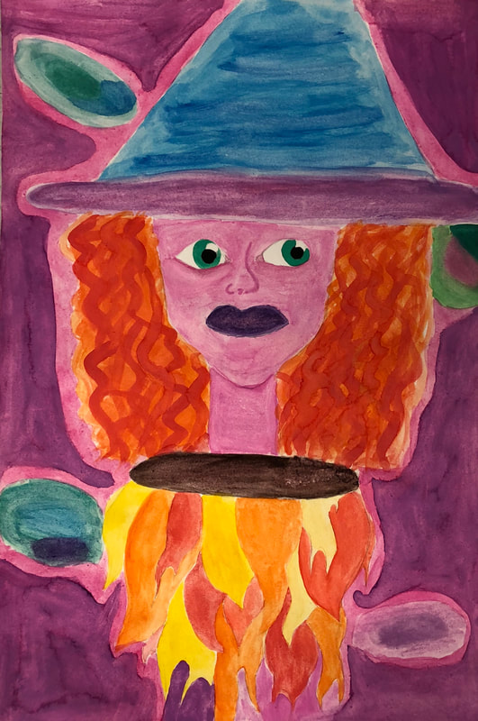
Witch Head in Space
Rachel Kadelbach Watercolor, 2018 The name of my project is "Witch Head in Space" and the medium of watercolor in the style of Surrealism. My theme is Mystical. In this project mystical comes into it with my witch who is traveling in the galaxy, that ties into my project because witches are magic and I think the galaxy is pretty magical too Early witches were people who practiced witchcraft, they used magic spells and called spirits for help or to bring change. Most witches were thought to be doing the Devil’s work. However many were simply natural healers. I created a witch because it's Halloween season and I put her in space because I needed to add a little Rachel to the project. I love Halloween and how you can just dress up in fun things, it's not all about scary stuff, but stuff you have the most fun with. My artistic technique was to do this piece in as a simple non dimensional watercolor piece to reflect surrealism. I first started my project by outlining my witch with an 6H pencil then got to the fun part, the watercolor! I like to move from the inside to the outside so I started with her nose and moved out from there. The elements I chose for this project are color and line. I used color in much of my project for the galaxy in the back to the witch herself. Line is in my project for mostly her face and hat. The principles I used were movement and variety. I think I have movement in my project because when you look at the picture you can image the witch going through the space. The variety in my project is the witch and background with the variety of colors in space compliment the colors of my witch. Crazy Fish
Rachel Kadelbach Art Markers, 2018 Crazy Fish is in the medium of art markers and is a Koi fish that is swimming in the magic of mushrooms. The style of art for my piece is once again, surrealism. When koi fish came about, it was the Japanese that first saw their great potential, and began breeding them to bring out their beautiful colors. The popularity of the Japanese Koi fish quickly grew, and soon became the most desired fish in the country. They were so popular that they were often given as gifts amongst royal families. Koi fish have distinct blood orange and white coloring that really catches the eye. It was intriguing to learn about them. I have always had an interest for Japanese culture, especially in a historical sense. The process of my creation started with finding the inspiration for the style I wanted to incorporate. Once I started envisioning my style, I thought about elements that would make for a really colorful art piece. First, I started by drawing my Koi fish onto the middle of the paper. From there, I just kind of went freestyle---filling the majority of the page with bubbles and bordering the bottom with mushrooms. I decided to surround the fish with bubbles with the thought process that bubbles are more light and floaty. And, for the mushrooms, I put them on the bottom because when I think of mushrooms, they grow from the ground. Plain and simple. I find this project goes with my mystical theme mostly because of my variance of coloring-purple, orange, green, blue, yellow, red, pink, you name it! When have you ever see a purple Koi fish swimming in orange bubbles and rainbow colored mushrooms? I'll answer for you, never. The two elements I used in this art work were form and shape. Form, an element of art that is three-dimensional and encloses volume, is used by giving the illusion the fish is swimming in the water. Shape, an element of art that is two-dimensional, flat, or limited to height and width, is shown by drawing the bubbles in a way that is two dimensional. Gradation and movement are the two principles I used. Gradation, a way of combining elements by using a series of gradual changes in those elements, is demonstrated through the characteristics of the mushrooms--- small, big, dark, and light. Movement, a principle of design used to create the look and feeling of action and to guide the viewer’s eye throughout the work of art, is also used to show the Koi fish weaving through the bubbles and water. 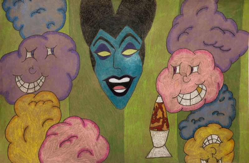
Disney Scares
Rachel Kadelbach Colored Pencil, 2018 The name of my work is called Disney Scares in the medium Colored Pencil. Maleficent is the center of my work, she is a villain character from the Disney movie sleeping beauty. In the movie Maleficent puts a unbreakable spell on Aurora, which the spell is, on her 16th birthday before the sun sets she will prick her finger on the spindle of a spinning wheel and die. By the end of the movie Maleficent turns into a dragon that prince Edward has to kill in order to save princess Aurora, which he does so and Maleficent dies. Sleeping Beauty was always my favorite Disney princess movie, mostly because I loved Maleficent. Yes, she is the evil character in this movie but I've always been fascinated by her approach and sleek look. The process of my creation started with my inspiration of wanting to do something not only with Maleficent in it but also the weird side of Disney in their movies and clashing it all together. I started to outline malelficent with a 5B pencil on brown paper so I could really have the colors pop when I would get to the fun part. When I was done with the outline, I wanted to use colors that brought childhood to mind, so why not use pinks, blues, and purples! Adding extra colors to make the art look more complete and full. This project relates to my theme of mystical because of its mystery of colors and the odd subjects add to the project to keep the view questioning and making it something they want to make it! Two elements I used for this color of a creation are form, an element of art that is three-dimensional and encloses volume, and color, an element of art made up of three properties: hue, value, and intensity. I used form in my project with my clouds, the way they look popping out and fluffly. Color was used in all of this project, I used multiply shades to one subject to make the shading and filling of the project. Two principles used in this project were emphasis, a way of combining elements to stress the differences between those elements, and rhythm, a principle of design that indicates movement, created by the careful placement of repeated elements in a work of art to cause a visual tempo or beat. Rhythm comes with the clouds, you see them flow throughout the piece which makes a tempo. |
|
|
